This guide provides an in-depth exploration of styling options available in Skeleton. Whether you're creating a unique theme, customizing elements, or adjusting component props. You'll find a variety of useful tips and techniques for customizing your project.
Themes
Themes have a major impact into the overall design process in Skeleton. This is accomplished using CSS properties (aka CSS variables) that define your color palette, fonts, border sizes, and other useful settings.
The Skeleton library provides both preset themes, as well as a theme generator, allowing you to create custom themes from scratch. Let's being by reviewing theme options.
Preset Themes
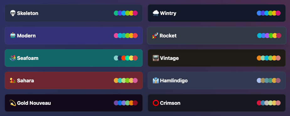
By default, Skeleton comes with a set of curated preset themes. Each theme is hand crafted and provides support for both light and dark modes, while ensuring adequate color contrast for accessibility. Furthermore each preset contains optional features to extend and augment your app design, such as a background mesh gradients. If you're in a hurry to get started, preset theme provide a quick and effortless way to import the style of your app out of the box.
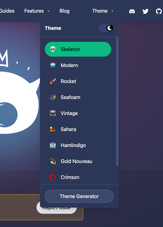
Please be aware you can test each preset using the "Theme" drop down at the top-right of the Skeleton documentation. Select any preset theme option and you'll immediately see a live preview that carries through the entire site.
Once you've decided on the theme, visit the Guides > Themes to learn more about how themes operate. To implement a preset theme, first you need to register you preferred theme(s) in tailwind.config.[ts|js]. This will ensure each theme is available to use.
plugins: [
	skeleton({
		themes: { preset: [ "skeleton", "wintry", "modern" ] }
	})
]
This registers three preset themes to choose from.
Next, open /src/app.html and set the active theme using the data-theme attribute.
<body data-theme="skeleton">This set the active theme to "skeleton".
Theme Generator
In most cases presets are a great starting point, but if you're designing your project for a company, you may wish to adhere to certain brand colors and aesthetics. Thankfully Skeleton provides a robust Theme Generator to help get you started.
Note the generator has recently received several major updates to expand the color palette, improved a11y color ratios, as well as make the UI and UX more intuitive and useful.
You can find the newly revamped Theme Generator here:

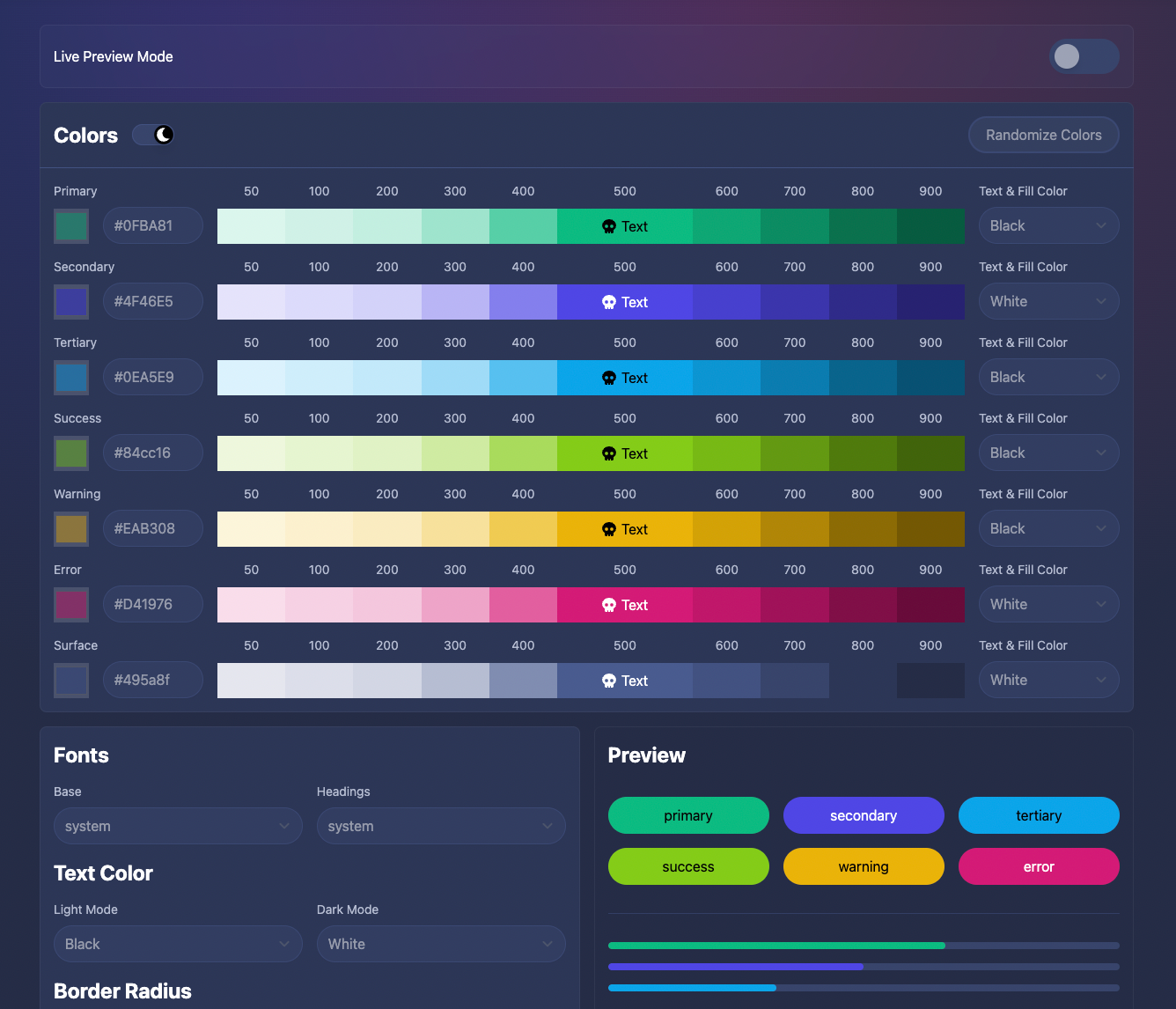
Simply toggle ON the "Live Preview Mode" option and begin editing the colors and settings. You'll note the entire documentation site updates to reflect your changes. Custom styles will even persist as you browse to other pages on the site, providing an excellent way to preview changes to components and other features right away. Use this to test color balance between light and dark modes as well.
If you're not design savvy, don't worry, we've provided a "Randomize Colors" button to quickly generate a palette for you. For best results we recommend randomizing until you find a nice foundation, then fine tune each color to your preference. Be mindful not to make colors too light or dark. Each row and shade should have a unique value.
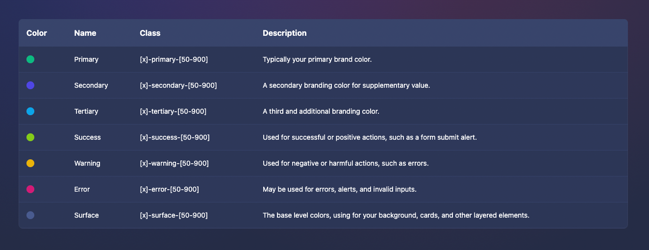
Here's a quick reference for what each color represents in your theme:
The process for implementing a custom theme is very similar to using a presets. Generate your theme, copy the generated CSS, then add this to a new file in the root of your project, such as my-custom-theme.ts.
Open tailwind.config.[ts|js] found in the root of your project, and import your custom theme as shown. Note we've abbreviated some of the code here:
import { myCustomTheme } from './my-custom-theme'

// ...

plugins: [
	skeleton({
		themes: {
			custom: [
				myCustomTheme
			]
		}
	})
]
Append one or more custom themes within the custom settings.
Next, open /src/app.html and set the active theme using the data-theme attribute.
<body data-theme="my-custom-theme">This set the active theme to "my-custom-theme".
Dark Mode
Skeleton provides support for light and dark modes for all themes by default. This feature is enabled directly by Tailwind. We highly recommend reviewing their official documentation if you wish to learn more about how this works.
Utility Classes
Skeleton includes a Tailwind Plugin that is used to create a set of Tailwind utility classes for your theme's color palette. For example, here's how the primary color shade 500 is represented in the default Skeleton theme:
--color-primary-500: 15 186 129;These are RGB (red green blue) color values for the hex color #0FBA81
Skeleton follows the official Tailwind recommendation for implementing CSS properties with RGB values. This allows for color opacity via the alpha channel. We've provided a few examples of these generate classes below:
<!-- background utility class -->
<div class="bg-primary-500">Skeleton</div>

<!-- background with 50% transparency utility class -->
<div class="bg-primary-500/50">Skeleton</div>

<!-- text color utilty class -->
<div class="text-primary-500">Skeleton</div>

<!-- border utility class -->
<div class="border border-primary-500">Skeleton</div>

<!-- @apply syntax in <style> blocks -->
<style lang="postcss"
    .example { @apply text-primary-500; }
</style>
Utility color classes provide a quick and easy way to implement your custom theme colors in custom elements and components in your project.
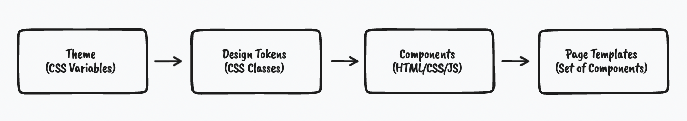
Design Tokens
If you're not familiar with design tokens, we highly recommend the the following conference talk by Brad Frost. He does an excellent job of explaining the concept.
Design tokens are reminiscent of utility classes. However, tokens go well beyond what Tailwind provides out of the box, with a focus on reusability and consumption of the CSS properties set in your theme.
Design tokens take in your theme CSS properties, then apply this in a set of reusable classes that serve as the building blocks for many of the elements and components found in Skeleton.
Let's walk through the process of creating a design token. Here we have the light and dark text color set in our theme configuration:
--theme-font-color-base: 0 0 0;
--theme-font-color-dark: 255 255 255;
The light theme (base) text color is black, while the dark theme is white.
However, by default, Tailwind doesn't know about these custom property values or provide utility classes for them. This is where Skeleton introduces a set of design token CSS classes use the property setting:
.text-base-token {
	color: rgba(var(--theme-font-color-base));
}
.text-dark-token {
	color: rgba(var(--theme-font-color-dark));
}
.text-token {
	@apply text-base-token dark:text-dark-token;
}.text-base-tokenprovides only the light theme text color..text-dark-tokenprovides only the dark theme text color..text-tokencombines both tokens above to handle light and dark modes.
By using .text-token in a custom component, you can ensure the text color always conforms to your appropriate theme values in both light and dark modes automatically.
Here's another quick example using the border radius setting from your theme:
.rounded-token {
	border-radius: var(--theme-rounded-base);
}
.rounded-tl-token {
	border-top-left-radius: var(--theme-rounded-base);
}
.rounded-tr-token {
	border-top-right-radius: var(--theme-rounded-base);
}
.rounded-bl-token {
	border-bottom-left-radius: var(--theme-rounded-base);
}
.rounded-br-token {
	border-bottom-right-radius: var(--theme-rounded-base);
}
This covers all colors, plus each of the four available corner positions (ex: top-left)
The exciting part of design tokens, is if any of the base theme values are modified, every design token class that utilizes those setting will be updated, which means every component using that class will update as well.
See the clip below to see this in action. Note how the button colors, fonts, and border radius all update when we switch between preset themes:
The best part about design tokens is they're not just available to us, the creators of Skeleton, but you and your projects as well. This allows you to construct custom elements and components using the same tools we do, and take advantage of all the same benefits!
To learn more about design tokens, please see the dedicated documentation section linked below:
Skeleton Labs
Color Pairings
The visualization below displays what we call color parings. This is an important concept to learn if you wish to understand how Skeleton balances colors - specifically for light and dark mode.
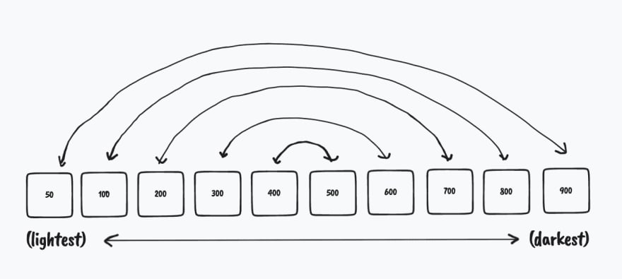
For example, the surface color swatch 50 is the lightest available color, so we automatically utilize that for your light theme background color. Swatch 900 is the darkest, so vice versa. These two colors form a pair.
Skeleton provides a set of design tokens such as .bg-surface-50-900-token and bg-surface-900-50-token which automatically toggles between these in light/dark mode respectively. Again, see the design token documentation for more information on what styles pairings are available.
Customizing Elements
While Skeleton is designed with Svelte in mind, not every feature can or should be implemented as a component. Instead, in most cases it's much easier to utilize semantic elements created via HTML and CSS. In Skeleton we call these "elements". These provide styles for the default background color, typography, and form styles, as well as specific elements such as buttons, lists, and cards.
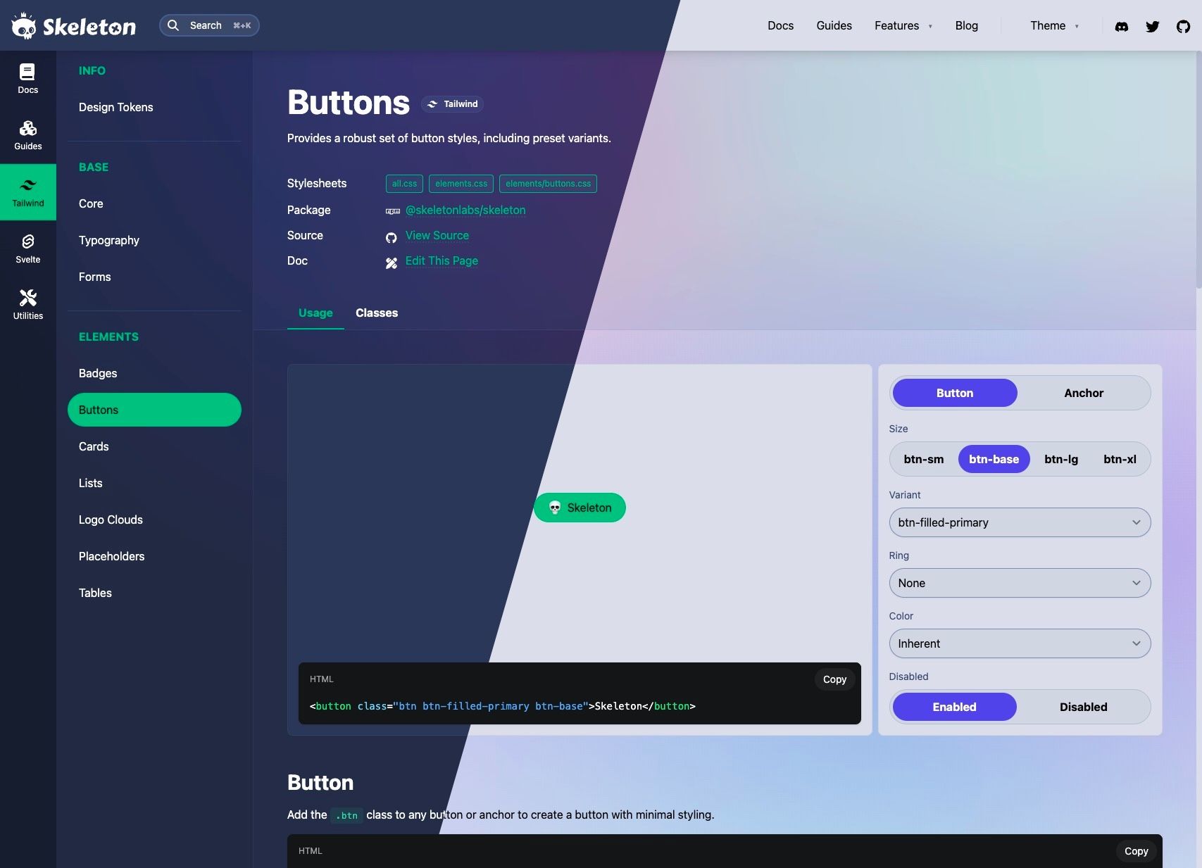
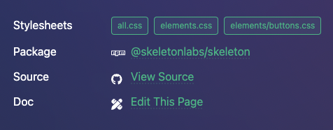
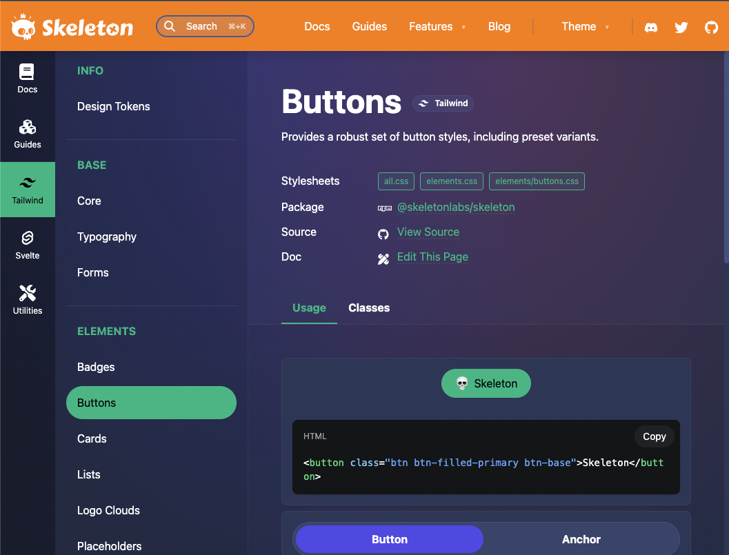
For example, click the link below to view the source for button styles:
 skeletonlabs
View the Buttons stylesheet
This following snippet shows the base styles for the .btn (button) class. You'll note that it's just CSS written in the Tailwind @apply format.
.btn {
/* Size (match base) */
@apply text-base px-5 py-[9px];
/* Core */
@apply text-center whitespace-nowrap;
/* Flex Columns */
@apply inline-flex justify-center items-center space-x-2;
/* Hover */
@apply hover:brightness-110;
/* Transitions */
@apply transition-all active:scale-90;
/* Theme: Rounded */
@apply rounded-token;
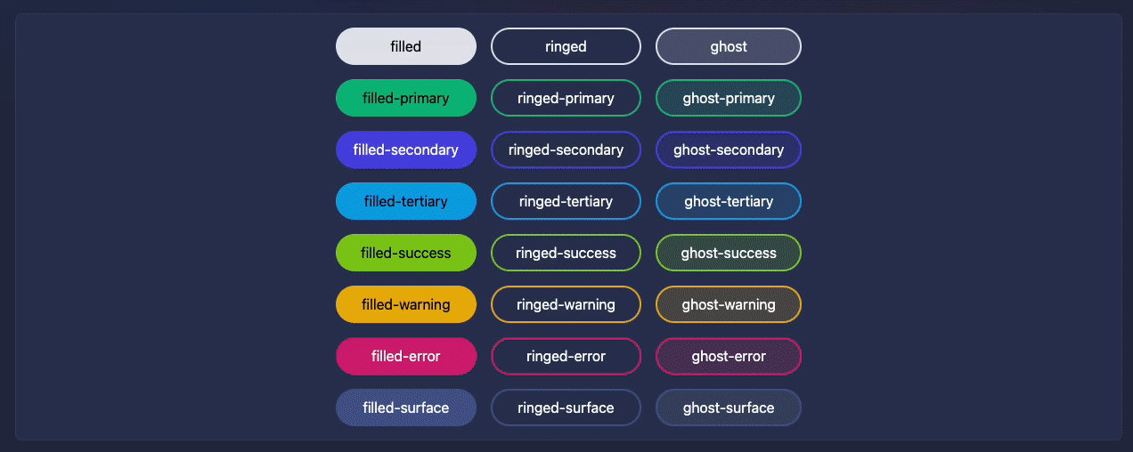
}By pairing element classes together, we can can easily mix and match to create interesting combinations, such as this filled button style:
<button class="btn btn-filled-primary">💀 Skeleton</button>

The important take away here is that elements are just CSS. If you're familiar with CSS, then you should understand the concept of cascading, which allows you to easily override and extend styles. Here's a trivial example:
/* The background will initially be red */
.example { background: red; }

/* The background cascades to green and font is set bold */
.example { background: green; font-weight: bold; }
Styles that come later in the flow take precedence.
Please be aware that all Skeleton styles and themes properties are injected via the Skeleton Tailwind plugin. This means we can easily modify and overrides styles either in our Tailwind config or using the app.postcss global stylesheet.
For example, this is the source for the button class of .btn-filled-primary:
.btn-filled-primary {
    @apply bg-primary-500 text-on-primary-token;
}
Now let's modify the default background color as well as make the font bold. Add the following to your global stylesheet in /src/app.postcss in your project:
.btn-filled-primary {
    @apply bg-purple-500 font-bold;
}
If you wish to go further, we recommend consulting the stylesheet source code for each element in the Tailwind > Elements section. Just tap the "view source" link at the top of each element documentation page.
Note that when overriding these inherent styles you may need to modify BOTH the light and dark mode color variations or append ! (important) as shown below:
/* Override the light and dark mode values */
.example-element { @apply bg-blue-500 dark:bg-purple-500; }

/* Set !important to override both modes */
.example-element { @apply !bg-green-500; }
Customizing Components
One of the most powerful features in Svelte and Skeleton is the ability to modify styles and settings per each component instance. We'll review a few techniques for customizing component in this manner.
Via Style Props
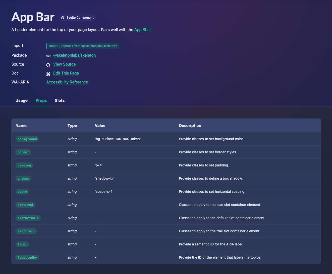
Unlike other UI libraries, Skeleton doesn't rely on canned options for props (ex: small, medium, large), but instead allows you to pass one or more CSS classes that directly override a style. Take this App Bar component for example:
<AppBar background="bg-red-500 dark:bg-orange-500">Skeleton</AppBar>Here we've used the background prop and provided Tailwind utility classes to modify the appearance in both light and dark modes. In light mode the background will appear red, while in dark mode the background will be orange.
We can take this a step further by using design tokens to provide a more compact and reusable format for this kind of change:
<AppBar background="bg-primary-400-500-token">Skeleton</AppBar>This specific design token represents the following styles:
.bg-primary-400-500-token {
	@apply bg-primary-400 dark:bg-primary-500;
}
Your not limited to just background colors though. Each component documentation page provides a "Props" tab, which covers available properties, their default setting, along with a brief description. This is one of the most important resources available in the documentation when it comes to modifying components:
Via the Classes Attribute
These "style props" cover common customization targets, however, if a property is not available, don't fret - you can still provide custom classes. Each component in Skeleton supports a standardized class attribute. Which allows you to pass arbitrary Tailwind classes as shown:
<ExampleComponent class="border-4 border-red-500">Skeleton</ExampleComponent>Please note these classes are applied ONLY to the parent element in the component template. To understand this, imagine the following is the contents of our fake component called ExampleComponent. This represents the HTML template within the .svelte file:
<div class="{customClassesAddedHere}">
    <header><slot /></header>
<div>
But what if you need to go deeper and target that header element? Thankfully Tailwind provides a solution via the arbitrary variant syntax:
<ExampleComponent class="[&>header]:p-4">...</ExampleComponent>
This would provide a .p-4 padding class to the header element.
Via a Global Stylesheet
If the change you're trying to make should be applied to ALL instances of a particular component, the best way to do this is to modify the component with your global stylesheet. You'll find this process is very similar to styling Skeleton elements.
Each component constructed in Skeleton implements uniquely named "selector" classes, such as .avatar-image for the Avatar component. These classes are implemented with one purpose - to provide semantic handles for global styles.
<img class="avatar-image ..." />Note the the .avatar-image class in the Avatar component markup.
To modify a portion of our component template, all we need to do is provide a class in our application's global stylesheet as shown:
.avatar-image { @apply invert; }
This global style will invert the colors of the avatar image.
The quickest way to find a particular selector class is either to view the component source on GitHub, or utilize your browser's Inspect tool to locate the class directly in the DOM.
For most browsers you can right-clicking on the item you wish to modify, then choose the "Inspect" option in the popup. This will launch your browser's dev tools. Make sure the Elements tab is selected, then navigate the DOM tree until you find the element you wish to modify.
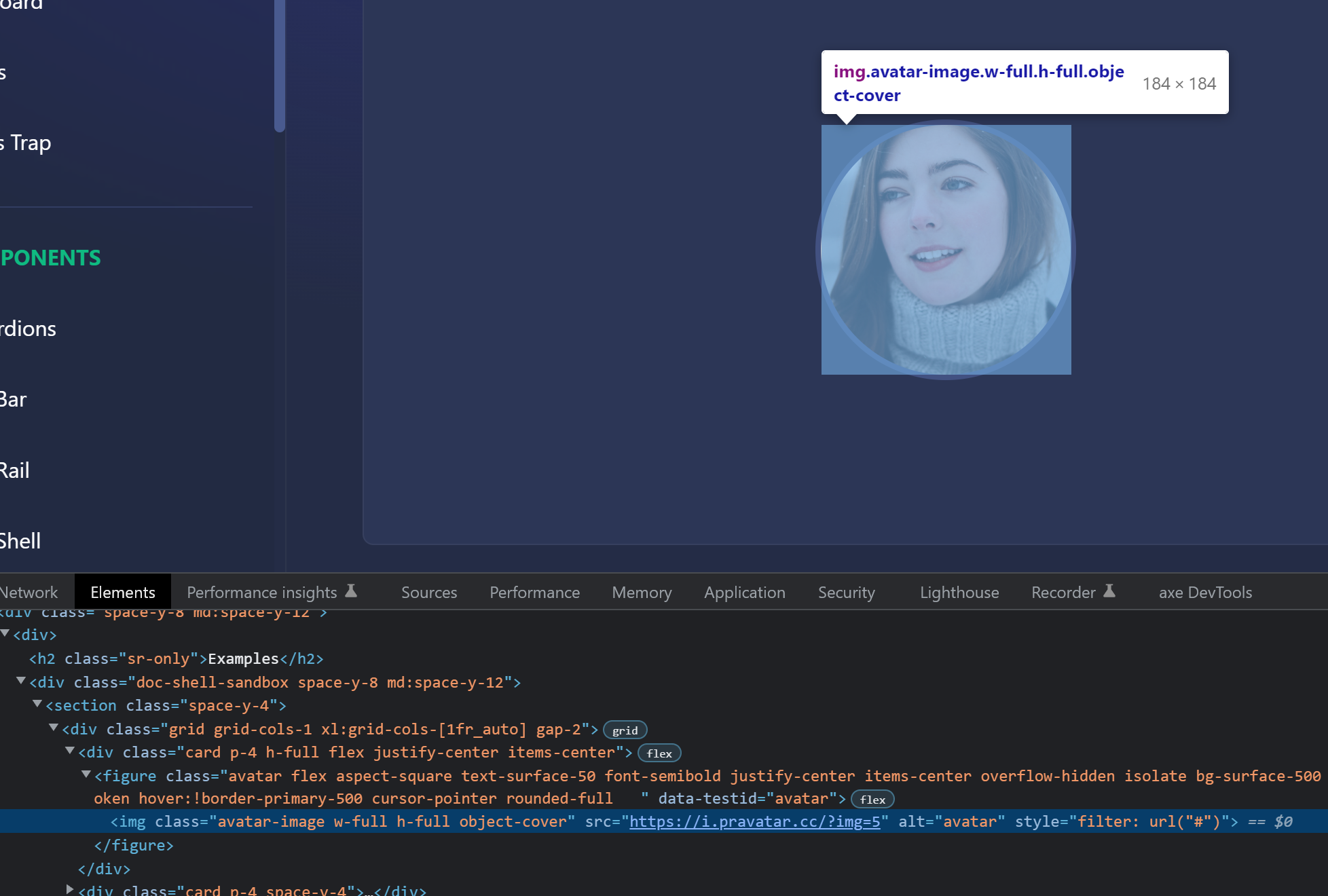
Note the selector class is always the first in the set to ensure they are easy to locate!
Customizing Utilities
Skeleton provides a wide assortment of utility features. These are created using a combination of Skeleton's element styles, components, actions, and in some cases introduce third party libraries. Given this, you can utilize many of the techniques described above.
For example, let's take a look at how we might modify styles for the Drawer utility.
Styling Drawers
The Skeleton drawer allows you to create slide out overlays attached to any window edge. Drawers can be customized in a couple different ways.
First, you can adjust the style props on the Drawer component itself. Our tips regarding style props for components will apply here.
<Drawer bgDrawer="bg-primary-100-800-token" bgBackdrop="bg-surface-primary-token"/>All instances of the drawer will now have a primary color for the backdrop and window.
Second, you can style each instance of the drawer dynamically by providing available style props as key/value pairs in the DrawerSettings object:
function drawerOpenStyled(): void {
	const settings: DrawerSettings = {
		// ...
		bgDrawer: 'bg-primary-500 text-on-primary-token',
		bgBackdrop: 'bg-primary-500/50',
	};
	drawerStore.open(settings);
}
We use the same bgDrawer and bgBackdrop settings here.
Note that Skeleton Modals and Toasts use the same conventions as well! Please consult the documentation for each utility feature to learn more about how to customize each one.
Wrapping Up
Given the amount of options provided, we feel confident in saying that Skeleton provides one of the most extensible design systems. We encourage you to test these techniques in your own projects. However, if you need more help, don't be afraid to reach out via the Skeleton GitHub or Discord.